
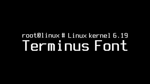
Beyond technical improvements, Linux Kernel 6.19 will also deliver something that, oddly enough, can be seen from a more aesthetic point of view. And more specifically, it is set to introduce a new Terminus 10×18 console bitmap font, offering a clearer, more balanced option for users who rely on text-mode consoles.
The addition arrives through a recent PR as part of a broader set of fbdev updates targeting the 6.19-rc1 cycle. Expectations are that the new font will improve readability in environments where console clarity still matters, especially on modern laptops and framebuffer-based systems.
The Terminus 10×18 font is designed specifically for mid-density 13–16-inch laptop displays with resolutions such as 1280×800 and 1440×900. Existing built-in fonts, most notably the long-standing 8×16 fallback used by the kernel for decades, tend to appear cramped or thin on these panels.
Guys you have to see, it is amazing how much deep tech stuff you know, but dont forget you are a crazy niche within a niche and be nice to non-systems programmers XD